/* Nomad Line — marketing site sections.
   Pulls primitives from the design-system bundle and composes a landing page.
   Exports every section to window so index.html can assemble the page. */

const DS = window.NomadLineDesignSystem_60c9ae;
const { Button, IconButton, Badge, Tag, Avatar, Card, PhoneNumber, Input } = DS;

/* Re-run Lucide on every render so dynamically-added icons resolve. */
function useLucide() {
  React.useEffect(() => {
    if (window.lucide) window.lucide.createIcons();
  });
}
function Icon({ name, size = 22, color = "currentColor", stroke = 2, style = {} }) {
  return <i data-lucide={name} style={{ width: size, height: size, color, display: "inline-flex", strokeWidth: stroke, ...style }} />;
}
const wrap = { width: "100%", maxWidth: 1160, margin: "0 auto", padding: "0 28px", boxSizing: "border-box" };
const eyebrow = { fontFamily: "var(--font-mono)", fontSize: 12, fontWeight: 700, letterSpacing: "0.14em", textTransform: "uppercase", color: "var(--coral-600)" };

function useViewport() {
  const get = () => {
    const width = typeof window === "undefined" ? 1200 : window.innerWidth;
    return { width, isMobile: width < 680, isTablet: width >= 680 && width < 1024, isCompact: width < 1024 };
  };
  const [viewport, setViewport] = React.useState(get);
  React.useEffect(() => {
    const onResize = () => setViewport(get());
    window.addEventListener("resize", onResize);
    return () => window.removeEventListener("resize", onResize);
  }, []);
  return viewport;
}

/* ---- i18n: key conversion copy localized across EN / PT / ES ---- */
const STR = {
  en: { nav: ["How it works", "Features", "Local Mode", "Stories"], signin: "Sign in", join: "Join the waitlist",
    heroEyebrow: "Your line, always on", heroLead: "Keep your number.", heroBreak: "Wherever you ", heroHi: "land.",
    heroSub: "Keep your home number alive on any network for bank codes, WhatsApp and family — or call as a local anywhere with no number at all. One app for your whole phone life across borders.",
    joinBtn: "Join", social: "expats abroad on the list.", placeholder: "you@email.com",
    okTitle: "You're on the list.", okSub: "We'll email you the moment your country opens.",
    waitTitle: "Don't lose your line at the border.", waitSub: "Get early access the moment your country opens. No spam — just the one email that matters.", waitBtn: "Keep my number", waitOk: "You're on the list — welcome aboard." },
  pt: { nav: ["Como funciona", "Recursos", "Local Mode", "Histórias"], signin: "Entrar", join: "Entrar na lista",
    heroEyebrow: "Sua linha, sempre ativa", heroLead: "Mantenha seu número.", heroBreak: "Onde quer que você ", heroHi: "esteja.",
    heroSub: "Mantenha seu número de casa ativo em qualquer rede para códigos do banco, WhatsApp e família — ou ligue como local em qualquer lugar, sem número nenhum. Um app para toda a sua vida telefônica entre fronteiras.",
    joinBtn: "Entrar", social: "brasileiros no exterior na lista.", placeholder: "voce@email.com",
    okTitle: "Você está na lista.", okSub: "Avisamos assim que seu país abrir.",
    waitTitle: "Não perca sua linha na fronteira.", waitSub: "Acesso antecipado assim que seu país abrir. Sem spam — só o e-mail que importa.", waitBtn: "Manter meu número", waitOk: "Você está na lista — bem-vindo!" },
  es: { nav: ["Cómo funciona", "Funciones", "Local Mode", "Historias"], signin: "Entrar", join: "Unirme a la lista",
    heroEyebrow: "Tu línea, siempre activa", heroLead: "Conserva tu número.", heroBreak: "Estés donde ", heroHi: "estés.",
    heroSub: "Mantén tu número de casa activo en cualquier red para códigos del banco, WhatsApp y familia — o llama como local en cualquier sitio, sin número. Una app para toda tu vida telefónica entre fronteras.",
    joinBtn: "Unirme", social: "expatriados en la lista.", placeholder: "tu@email.com",
    okTitle: "Estás en la lista.", okSub: "Te avisaremos en cuanto abra tu país.",
    waitTitle: "No pierdas tu línea en la frontera.", waitSub: "Acceso anticipado en cuanto abra tu país. Sin spam — solo el correo que importa.", waitBtn: "Conservar mi número", waitOk: "Estás en la lista — ¡bienvenido!" },
};
/* Hero "what reaches you" card — localized to the picked country */
const LOCALES = {
  en: { flag: "🇧🇷", place: "São Paulo, Brazil", number: "+55 11 99876-5432", bank: "Nubank", chip: "Nu", otp: <React.Fragment>Your access code is <b style={{ fontFamily: "var(--font-mono)" }}>48&nbsp;91&nbsp;06</b>. Don't share it.</React.Fragment>, deliver: "iFood", deliverMsg: "Your order is out for delivery! 🛵", contact: "Mãe" },
  pt: { flag: "🇧🇷", place: "São Paulo, Brasil", number: "+55 11 99876-5432", bank: "Nubank", chip: "Nu", otp: <React.Fragment>Seu código de acesso é <b style={{ fontFamily: "var(--font-mono)" }}>48&nbsp;91&nbsp;06</b>. Não compartilhe.</React.Fragment>, deliver: "iFood", deliverMsg: "Seu pedido saiu para entrega! 🛵", contact: "Mãe" },
  es: { flag: "🇪🇸", place: "Madrid, España", number: "+34 600 123 456", bank: "BBVA", chip: "bb", otp: <React.Fragment>Tu código BBVA es <b style={{ fontFamily: "var(--font-mono)" }}>48&nbsp;91&nbsp;06</b>. No lo compartas.</React.Fragment>, deliver: "Glovo", deliverMsg: "¡Tu rider está en camino! 🛵", contact: "Mamá" },
};

function LangSwitcher({ lang, setLang }) {
  const langs = [["en", "EN"], ["pt", "PT"], ["es", "ES"]];
  return (
    <div style={{ display: "inline-flex", alignItems: "center", gap: 2, padding: 3, borderRadius: 999, background: "var(--sand-100)", border: "1.5px solid var(--border-default)" }}>
      {langs.map(([code, label]) => (
        <button key={code} onClick={() => setLang(code)} style={{ border: "none", cursor: "pointer", padding: "5px 9px", borderRadius: 999, fontFamily: "var(--font-mono)", fontWeight: 700, fontSize: 11.5, letterSpacing: "0.04em",
          background: lang === code ? "var(--bg-surface)" : "transparent", color: lang === code ? "var(--coral-700)" : "var(--text-subtle)", boxShadow: lang === code ? "var(--shadow-sm)" : "none" }}>{label}</button>
      ))}
    </div>
  );
}

/* scroll-reveal wrapper */
/* entrance reveal — content always visible; gentle fade-in where the browser allows */
function Reveal({ children, from = "up", delay = 0, style = {} }) {
  return <div style={style}>{children}</div>;
}

/* ---------------------------------------------------------------- NAV */
function Nav({ onJoin, lang, setLang }) {
  const t = STR[lang] || STR.en;
  const { isMobile, isTablet } = useViewport();
  return (
    <header style={{ position: "sticky", top: 0, zIndex: 20, background: "rgba(251,247,240,0.82)", backdropFilter: "blur(10px)", borderBottom: "1.5px solid var(--border-subtle)" }}>
      <div style={{ ...wrap, height: isMobile ? 62 : 72, padding: isMobile ? "0 16px" : "0 28px", display: "flex", alignItems: "center", justifyContent: "space-between", gap: 14 }}>
        <img src="./assets/logo-lockup.svg" alt="Nomad Line" style={{ height: isMobile ? 30 : 34, width: isMobile ? 132 : 149, objectFit: "contain", objectPosition: "left center", flex: "0 0 auto" }} />
        <nav style={{ display: isMobile ? "none" : "flex", alignItems: "center", gap: isTablet ? 18 : 30 }}>
          {t.nav.map((l, i) => (
            <a key={l} href={["#journeys", "#features", "#local-mode", "#stories"][i]} style={{ fontSize: 14.5, fontWeight: 600, color: "var(--ink-700)", textDecoration: "none" }}>{l}</a>
          ))}
        </nav>
        <div style={{ display: "flex", alignItems: "center", gap: 10 }}>
          <Button variant="primary" size="sm" onClick={onJoin}>{t.join}</Button>
        </div>
      </div>
    </header>
  );
}

/* ---------------------------------------------------------------- HERO */
function Hero({ onJoin, lang }) {
  useLucide();
  const t = STR[lang] || STR.en;
  const c = LOCALES[lang] || LOCALES.en;
  const { isMobile, isCompact } = useViewport();
  const [email, setEmail] = React.useState("");
  const [done, setDone] = React.useState(false);
  return (
    <section style={{ background: "var(--bg-page)", overflow: "hidden" }}>
      <div style={{ ...wrap, display: "grid", gridTemplateColumns: isCompact ? "1fr" : "1.05fr 0.95fr", gap: isMobile ? 26 : 48, alignItems: "center", padding: isMobile ? "42px 18px 58px" : isCompact ? "58px 28px 74px" : "76px 28px 92px" }}>
        <div>
          <div style={{ display: "inline-flex", alignItems: "center", gap: 9, padding: "6px 12px", background: "var(--coral-50)", border: "1.5px solid var(--coral-200)", borderRadius: 999, marginBottom: 22 }}>
            <span style={eyebrow}>{t.heroEyebrow}</span>
          </div>
          <h1 style={{ fontFamily: "var(--font-display)", fontWeight: 800, fontSize: isMobile ? 42 : isCompact ? 54 : 62, lineHeight: 1.02, letterSpacing: "-0.03em", color: "var(--text-strong)", margin: 0 }}>
            {t.heroLead}<br />{t.heroBreak}<span style={{ color: "var(--coral-600)" }}>{t.heroHi}</span>
          </h1>
          <p style={{ fontSize: isMobile ? 17 : 19, lineHeight: 1.5, color: "var(--text-body)", maxWidth: 520, margin: "22px 0 30px", fontWeight: 500 }}>
            {t.heroSub}
          </p>

          {!done ? (
            <form onSubmit={(e) => { e.preventDefault(); if (email) setDone(true); }} style={{ display: "flex", flexDirection: isMobile ? "column" : "row", gap: 10, maxWidth: 440 }}>
              <div style={{ flex: 1 }}>
                <Input placeholder={t.placeholder} type="email" value={email} onChange={(e) => setEmail(e.target.value)} leading={<Icon name="mail" size={18} />} />
              </div>
              <Button variant="primary" size="md" type="submit">{t.joinBtn}</Button>
            </form>
          ) : (
            <div style={{ display: "flex", alignItems: "center", gap: 12, padding: "16px 20px", background: "var(--teal-50)", border: "1.5px solid var(--teal-200)", borderRadius: "var(--radius-md)", maxWidth: 440 }}>
              <span style={{ display: "inline-flex", width: 34, height: 34, borderRadius: 999, background: "var(--teal-500)", color: "#fff", alignItems: "center", justifyContent: "center", flex: "0 0 auto" }}><Icon name="check" size={20} /></span>
              <div><div style={{ fontWeight: 700, color: "var(--ink-900)" }}>{t.okTitle}</div><div style={{ fontSize: 14, color: "var(--ink-600)" }}>{t.okSub}</div></div>
            </div>
          )}

          <div style={{ display: "flex", alignItems: isMobile ? "flex-start" : "center", gap: 12, marginTop: 24, flexWrap: "wrap" }}>
            <div style={{ display: "flex" }}>
              {["Ana Lima", "João P", "Marina S", "Rafa"].map((n, i) => (
                <span key={n} style={{ marginLeft: i ? -10 : 0 }}><Avatar name={n} size={32} ring /></span>
              ))}
            </div>
            <span style={{ fontSize: 14, color: "var(--text-muted)", fontWeight: 500 }}><b style={{ color: "var(--ink-800)" }}>2,400+</b> {t.social}</span>
          </div>
        </div>

        {/* Visual — hero illustration */}
        <div style={{ position: "relative", display: "flex", justifyContent: "center", alignItems: "center" }}>
          <img src="./uploads/hero-nomadline-cartoon-appscreen-uk-transparent.png" alt="A traveler abroad keeping their home number" style={{ width: "100%", maxWidth: isMobile ? 330 : isCompact ? 440 : 560, height: "auto", display: "block" }} />
        </div>
      </div>
    </section>
  );
}

/* ----------------------------------------------------------- PROBLEM */
function Problem() {
  useLucide();
  const { isMobile, isTablet } = useViewport();
  const items = [
    { icon: "landmark", title: "Your bank locks you out", body: "No SMS code means no login. Nubank, Inter, Itaú — all of them text a number you can't receive abroad." },
    { icon: "message-circle", title: "WhatsApp asks to re-verify", body: "It's tied to a SIM you no longer have. One re-install and your whole history is gone." },
    { icon: "users", title: "Family can't reach you", body: "The number everyone saved for you stops ringing the day your home SIM goes quiet." },
  ];
  return (
    <section style={{ background: "var(--ink-900)", color: "var(--text-on-ink)", position: "relative" }}>
      <div style={{ ...wrap, padding: isMobile ? "58px 18px" : "84px 28px", position: "relative" }}>
        <div style={{ maxWidth: 640 }}>
          <div style={{ ...eyebrow, color: "var(--coral-400)" }}>The day it goes quiet</div>
          <h2 style={{ fontFamily: "var(--font-display)", fontWeight: 800, fontSize: isMobile ? 34 : 42, lineHeight: 1.06, letterSpacing: "-0.025em", color: "#fff", margin: "14px 0 0" }}>
            Lose your number, and your whole life locks up.
          </h2>
          <p style={{ fontSize: 18, lineHeight: 1.55, color: "var(--ink-300)", margin: "16px 0 0" }}>
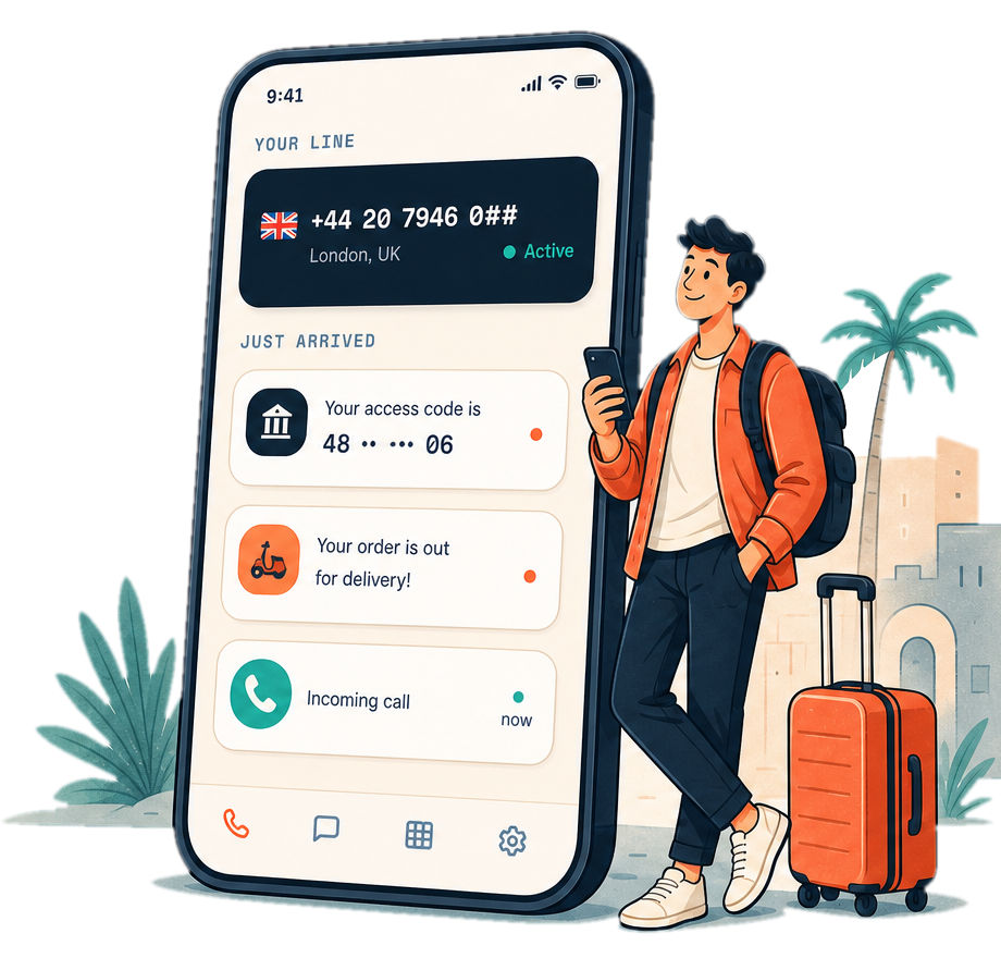
            When you move abroad, your phone number quietly becomes the most important thing you own. Here's what breaks the moment it stops working.
          </p>
        </div>
        <div style={{ display: "grid", gridTemplateColumns: isMobile ? "1fr" : isTablet ? "repeat(3,minmax(0,1fr))" : "repeat(3,1fr)", gap: 18, marginTop: 44 }}>
          {items.map((it) => (
            <div key={it.title} style={{ background: "rgba(255,255,255,0.04)", border: "1.5px solid rgba(255,255,255,0.10)", borderRadius: "var(--radius-lg)", padding: 24 }}>
              <span style={{ display: "inline-flex", width: 46, height: 46, borderRadius: 13, background: "var(--coral-500)", color: "#fff", alignItems: "center", justifyContent: "center", marginBottom: 16 }}><Icon name={it.icon} size={23} /></span>
              <div style={{ fontFamily: "var(--font-display)", fontWeight: 700, fontSize: 20, color: "#fff", marginBottom: 8 }}>{it.title}</div>
              <div style={{ fontSize: 15, lineHeight: 1.5, color: "var(--ink-300)" }}>{it.body}</div>
            </div>
          ))}
        </div>
      </div>
    </section>
  );
}

/* --------------------------------------------------------- HOW IT WORKS */
function HowItWorks() {
  useLucide();
  const steps = [
    { n: "01", icon: "globe", title: "Pick your country & number", body: "Choose a real, local number from Brazil — or keep the one you already have by porting it in." },
    { n: "02", icon: "wifi", title: "We keep it live on any data", body: "No SIM, no roaming. Your line rides on Wi-Fi or mobile data, on the phone you already use." },
    { n: "03", icon: "inbox", title: "Calls, texts & codes — anywhere", body: "Receive every OTP, every call, every message at home or abroad. Your identity travels with you." },
  ];
  return (
    <section style={{ background: "var(--bg-page)" }}>
      <div style={{ ...wrap, padding: "88px 28px" }}>
        <div style={{ textAlign: "center", maxWidth: 600, margin: "0 auto 52px" }}>
          <div style={eyebrow}>How it works</div>
          <h2 style={{ fontFamily: "var(--font-display)", fontWeight: 800, fontSize: 40, letterSpacing: "-0.025em", color: "var(--text-strong)", margin: "12px 0 0" }}>Three steps. Then never think about it again.</h2>
        </div>
        <div style={{ display: "grid", gridTemplateColumns: "repeat(3,1fr)", gap: 22 }}>
          {steps.map((s) => (
            <Card key={s.n} interactive padding={28}>
              <div style={{ display: "flex", alignItems: "center", justifyContent: "space-between", marginBottom: 20 }}>
                <span style={{ fontFamily: "var(--font-mono)", fontWeight: 700, fontSize: 14, color: "var(--coral-600)", letterSpacing: "0.1em" }}>{s.n}</span>
                <span style={{ display: "inline-flex", width: 48, height: 48, borderRadius: 14, background: "var(--teal-100)", color: "var(--teal-700)", alignItems: "center", justifyContent: "center" }}><Icon name={s.icon} size={24} /></span>
              </div>
              <div style={{ fontFamily: "var(--font-display)", fontWeight: 700, fontSize: 21, color: "var(--text-strong)", marginBottom: 9 }}>{s.title}</div>
              <div style={{ fontSize: 15, lineHeight: 1.55, color: "var(--text-muted)" }}>{s.body}</div>
            </Card>
          ))}
        </div>
      </div>
    </section>
  );
}

/* ------------------------------------------------------------- COMPARE */
function Compare() {
  useLucide();
  const { isMobile } = useViewport();
  const rows = [
    ["Keeps your home-country number", true, false, false, false],
    ["Receives bank OTP codes", true, false, "partial", false],
    ["Call as a local — free, no number", true, false, false, false],
    ["Forward texts to WhatsApp", true, false, false, false],
    ["Real-time translation & transcription", true, false, false, false],
    ["Works fully outside the US", true, false, true, "partial"],
    ["Built for expats", true, false, "partial", false],
  ];
  const cols = isMobile ? ["Nomad Line", "Google Voice"] : ["Nomad Line", "Google Voice", "Hushed", "Skype"];
  const Cell = ({ v }) => {
    if (v === true) return <span style={{ color: "var(--teal-600)" }}><Icon name="check" size={20} /></span>;
    if (v === "partial") return <span style={{ color: "var(--amber-500)" }}><Icon name="minus" size={20} /></span>;
    return <span style={{ color: "var(--ink-300)" }}><Icon name="x" size={20} /></span>;
  };
  return (
    <section style={{ background: "var(--bg-page)" }}>
      <div style={{ ...wrap, padding: isMobile ? "58px 18px" : "88px 28px" }}>
        <div style={{ maxWidth: 560, marginBottom: 40 }}>
          <div style={eyebrow}>The gap nobody fills</div>
          <h2 style={{ fontFamily: "var(--font-display)", fontWeight: 800, fontSize: isMobile ? 32 : 40, lineHeight: 1.08, letterSpacing: "-0.025em", color: "var(--text-strong)", margin: "12px 0 0" }}>Everyone else makes you choose. We don't.</h2>
        </div>
        <div style={{ background: "var(--bg-surface)", border: "1.5px solid var(--border-default)", borderRadius: "var(--radius-lg)", overflow: "hidden", boxShadow: "var(--shadow-md)" }}>
          <div style={{ display: "grid", gridTemplateColumns: isMobile ? "1.45fr repeat(2,0.7fr)" : "1.6fr repeat(4,1fr)", alignItems: "center", padding: isMobile ? "15px 12px" : "18px 24px", borderBottom: "1.5px solid var(--border-subtle)" }}>
            <span />
            {cols.map((c, i) => (
              <span key={c} style={{ textAlign: "center", fontWeight: 800, fontSize: isMobile ? 12.5 : 14.5, lineHeight: 1.15, fontFamily: "var(--font-display)", color: i === 0 ? "var(--coral-600)" : "var(--ink-600)" }}>{c}</span>
            ))}
          </div>
          {rows.map((r, ri) => (
            <div key={ri} style={{ display: "grid", gridTemplateColumns: isMobile ? "1.45fr repeat(2,0.7fr)" : "1.6fr repeat(4,1fr)", alignItems: "center", padding: isMobile ? "13px 12px" : "16px 24px", borderBottom: ri < rows.length - 1 ? "1px solid var(--border-subtle)" : "none", background: ri % 2 ? "var(--sand-50)" : "transparent" }}>
              <span style={{ fontSize: isMobile ? 13 : 15, lineHeight: 1.25, fontWeight: 600, color: "var(--ink-800)" }}>{r[0]}</span>
              {r.slice(1, isMobile ? 3 : 5).map((v, ci) => (
                <span key={ci} style={{ display: "flex", justifyContent: "center", background: ci === 0 ? "var(--coral-50)" : "transparent", padding: "6px 0", borderRadius: 8 }}><Cell v={v} /></span>
              ))}
            </div>
          ))}
        </div>
      </div>
    </section>
  );
}

/* ------------------------------------------------------------- WAITLIST */
function Waitlist({ ctaRef, lang }) {
  useLucide();
  const t = STR[lang] || STR.en;
  const { isMobile } = useViewport();
  const [email, setEmail] = React.useState("");
  const [done, setDone] = React.useState(false);
  return (
    <section id="waitlist" ref={ctaRef} style={{ background: "var(--bg-page)" }}>
      <div style={{ ...wrap, padding: isMobile ? "28px 18px 68px" : "40px 28px 96px" }}>
        <div style={{ position: "relative", background: "var(--coral-500)", borderRadius: isMobile ? 22 : 32, padding: isMobile ? "36px 22px" : "64px 56px", overflow: "hidden", boxShadow: "var(--shadow-coral)" }}>
          <div style={{ position: "absolute", inset: 0, background: "url('./assets/pattern-route.svg')", backgroundSize: 200, opacity: 0.18, mixBlendMode: "overlay" }} />
          <div style={{ position: "relative", maxWidth: 560 }}>
            <h2 style={{ fontFamily: "var(--font-display)", fontWeight: 800, fontSize: isMobile ? 32 : 44, lineHeight: 1.04, letterSpacing: "-0.03em", color: "#fff", margin: 0 }}>{t.waitTitle}</h2>
            <p style={{ fontSize: 18, lineHeight: 1.5, color: "rgba(255,255,255,0.92)", margin: "16px 0 28px", fontWeight: 500 }}>{t.waitSub}</p>
            {!done ? (
              <form onSubmit={(e) => { e.preventDefault(); if (email) setDone(true); }} style={{ display: "flex", flexDirection: isMobile ? "column" : "row", gap: 10, maxWidth: 460 }}>
                <input placeholder={t.placeholder} type="email" value={email} onChange={(e) => setEmail(e.target.value)}
                  style={{ flex: 1, minWidth: 0, width: "100%", height: 48, padding: "0 16px", border: "1.5px solid rgba(255,255,255,0.4)", outline: "none", borderRadius: "var(--radius-md)", background: "var(--bg-surface)", boxShadow: "var(--shadow-sm)", fontFamily: "var(--font-sans)", fontSize: 15, fontWeight: 600, color: "var(--text-strong)" }} />
                <Button variant="secondary" size="md" type="submit">{t.waitBtn}</Button>
              </form>
            ) : (
              <div style={{ display: "inline-flex", alignItems: "center", gap: 11, padding: "16px 22px", background: "rgba(21,32,46,0.9)", borderRadius: "var(--radius-md)" }}>
                <span style={{ color: "var(--teal-400)" }}><Icon name="check-circle" size={22} /></span>
                <span style={{ color: "#fff", fontWeight: 700 }}>{t.waitOk}</span>
              </div>
            )}
          </div>
        </div>
      </div>
    </section>
  );
}

/* ------------------------------------------------------------ LOCALMODE */
function LocalMode() {
  useLucide();
  const { isMobile, isCompact } = useViewport();
  return (
    <section id="local-mode" style={{ background: "var(--ink-900)", color: "#fff", padding: isMobile ? "62px 0" : "92px 0", overflow: "hidden" }}>
      <div style={{ ...wrap, padding: isMobile ? "0 18px" : "0 28px", display: "grid", gridTemplateColumns: isCompact ? "1fr" : "1.1fr 0.9fr", gap: isMobile ? 34 : 56, alignItems: "center" }}>
        <div>
          <div style={{ ...eyebrow, color: "var(--coral-400)" }}>Local Mode · free on every plan</div>
          <h2 style={{ fontFamily: "var(--font-display)", fontWeight: 800, fontSize: isMobile ? 34 : 46, lineHeight: 1.04, letterSpacing: "-0.03em", margin: "14px 0 18px", color: "#fff" }}>Call abroad as a local — for pennies.</h2>
          <p style={{ fontSize: 18, lineHeight: 1.55, color: "var(--ink-200)", margin: "0 0 26px", maxWidth: 520 }}>
            Stuck in a new country with sky-high call rates? Turn on <strong style={{ color: "#fff" }}>Local Mode</strong> and Nomad Line places your call from a temporary local number — so it lands as a cheap local call, not an international one. No subscription needed to start.
          </p>
          <div style={{ display: "flex", flexDirection: "column", gap: 14, maxWidth: 480 }}>
            {[
              ["radar", "Dial any number — we detect the country automatically"],
              ["wallet", "Pay as you go in credits. No plan required to try it"],
              ["shield-check", "The temporary number is throwaway and private"],
            ].map(([ic, tx]) => (
              <div key={tx} style={{ display: "flex", alignItems: "center", gap: 13 }}>
                <span style={{ width: 40, height: 40, borderRadius: 12, background: "rgba(255,106,69,0.16)", color: "var(--coral-400)", display: "inline-flex", alignItems: "center", justifyContent: "center", flex: "0 0 auto" }}><Icon name={ic} size={20} /></span>
                <span style={{ fontSize: 15.5, color: "var(--ink-100)", fontWeight: 500 }}>{tx}</span>
              </div>
            ))}
          </div>
        </div>
        {/* dialer vignette */}
        <div style={{ justifySelf: "center", width: "min(300px, 100%)", background: "linear-gradient(165deg,#2B3E56,#15202E 72%)", borderRadius: 28, padding: "26px 22px", boxShadow: "var(--shadow-xl)", border: "1px solid rgba(255,255,255,0.08)", textAlign: "center" }}>
          <div style={{ display: "inline-flex", alignItems: "center", gap: 8, padding: "8px 13px", borderRadius: 999, background: "var(--coral-50)", color: "var(--coral-700)", fontWeight: 700, fontSize: 13, whiteSpace: "nowrap" }}>
            <Icon name="radar" size={15} /> Local Mode
          </div>
          <div style={{ fontFamily: "var(--font-mono)", fontWeight: 700, fontSize: 26, color: "#fff", margin: "26px 0 10px", textAlign: "center" }}>+44 20 ••• ••••</div>
          <div style={{ display: "inline-flex", alignItems: "center", gap: 7, padding: "7px 13px", borderRadius: 999, background: "rgba(255,106,69,0.18)", color: "#FFD2C5", fontWeight: 700, fontSize: 12.5, whiteSpace: "nowrap" }}>
            <Icon name="map-pin" size={13} /> Calling as a 🇬🇧 local · 2 cr/min
          </div>
          <div style={{ display: "flex", justifyContent: "center", marginTop: 24 }}>
            <span style={{ width: 62, height: 62, borderRadius: 999, background: "var(--coral-500)", display: "inline-flex", alignItems: "center", justifyContent: "center", color: "#fff", boxShadow: "var(--shadow-coral)" }}><Icon name="radar" size={26} /></span>
          </div>
        </div>
      </div>
    </section>
  );
}

/* -------------------------------------------------------------- PRICING */
function Pricing({ onJoin }) {
  useLucide();
  const plans = [
    { name: "Expat", price: "€4", numbers: "1 number", tagline: "Settle into one new country", popular: false,
      features: ["1 local number", "SMS + bank OTPs", "Local Mode (credits)", "Voicemail & history"] },
    { name: "Traveler", price: "€9", numbers: "2 numbers", tagline: "Split your life between two places", popular: true,
      features: ["Everything in Expat", "2 local numbers", "Forward to WhatsApp", "Port a number in"] },
    { name: "Nomad", price: "€19", numbers: "5 numbers", tagline: "Live across every border", popular: false,
      features: ["Everything in Traveler", "5 local numbers", "Real-time message translation", "Live call transcription"] },
  ];
  return (
    <section style={{ background: "var(--sand-100)", padding: "96px 0" }}>
      <div style={{ ...wrap }}>
        <div style={{ textAlign: "center", maxWidth: 640, margin: "0 auto 14px" }}>
          <div style={eyebrow}>Pricing</div>
          <h2 style={{ fontFamily: "var(--font-display)", fontWeight: 800, fontSize: 44, lineHeight: 1.05, letterSpacing: "-0.03em", color: "var(--ink-900)", margin: "12px 0 14px" }}>Pick a plan for how far you roam.</h2>
          <p style={{ fontSize: 17, lineHeight: 1.5, color: "var(--text-muted)", margin: 0 }}>Numbers and advanced features live on a subscription. <strong style={{ color: "var(--ink-900)" }}>Local Mode is free on every plan.</strong></p>
        </div>
        <div style={{ display: "grid", gridTemplateColumns: "repeat(3,1fr)", gap: 22, marginTop: 44 }}>
          {plans.map((p) => (
            <div key={p.name} style={{ position: "relative", background: "var(--bg-surface)", borderRadius: 24, padding: "30px 28px", border: p.popular ? "2px solid var(--coral-400)" : "1.5px solid var(--border-default)", boxShadow: p.popular ? "var(--shadow-lg)" : "var(--shadow-sm)" }}>
              {p.popular && <span style={{ position: "absolute", top: -12, left: 28, fontFamily: "var(--font-mono)", fontSize: 11, fontWeight: 700, letterSpacing: "0.08em", color: "#fff", background: "var(--coral-500)", padding: "5px 11px", borderRadius: 999 }}>MOST POPULAR</span>}
              <div style={{ fontFamily: "var(--font-display)", fontWeight: 800, fontSize: 24, color: "var(--ink-900)" }}>{p.name}</div>
              <div style={{ fontSize: 14, color: "var(--text-muted)", marginTop: 2 }}>{p.tagline}</div>
              <div style={{ display: "flex", alignItems: "baseline", gap: 4, margin: "20px 0 4px" }}>
                <span style={{ fontFamily: "var(--font-display)", fontWeight: 800, fontSize: 42, color: "var(--ink-900)", letterSpacing: "-0.02em" }}>{p.price}</span>
                <span style={{ fontSize: 15, color: "var(--text-subtle)" }}>/mo</span>
              </div>
              <div style={{ display: "inline-flex", alignItems: "center", gap: 7, padding: "5px 11px", borderRadius: 999, background: "var(--ink-900)", color: "#fff", marginBottom: 22 }}>
                <Icon name="phone" size={13} color="var(--coral-400)" /><span style={{ fontFamily: "var(--font-mono)", fontWeight: 700, fontSize: 12.5 }}>{p.numbers}</span>
              </div>
              <div style={{ display: "flex", flexDirection: "column", gap: 11, marginBottom: 26 }}>
                {p.features.map((f) => (
                  <div key={f} style={{ display: "flex", alignItems: "center", gap: 10, fontSize: 14.5, color: "var(--ink-800)" }}>
                    <Icon name="check" size={16} color="var(--teal-600)" /> {f}
                  </div>
                ))}
              </div>
              <Button variant={p.popular ? "primary" : "outline"} block onClick={onJoin}>Get {p.name}</Button>
            </div>
          ))}
        </div>
      </div>
    </section>
  );
}

/* ------------------------------------------------------------ PERSONAS */
const _statusBar = (
  <div style={{ display: "flex", alignItems: "center", justifyContent: "space-between", padding: "11px 18px 4px" }}>
    <span style={{ fontFamily: "var(--font-mono)", fontWeight: 700, fontSize: 12, color: "var(--ink-900)" }}>9:41</span>
    <span style={{ display: "inline-flex", gap: 5, color: "var(--ink-700)" }}><Icon name="signal" size={13} /><Icon name="wifi" size={13} /><Icon name="battery-full" size={13} /></span>
  </div>
);
function PhoneFrameM({ children, dark }) {
  const { isMobile } = useViewport();
  return (
    <div style={{ width: isMobile ? "min(284px, 100%)" : 300, background: "#0C141E", borderRadius: isMobile ? 38 : 42, padding: 9, boxShadow: "0 26px 50px rgba(21,32,46,0.22)" }}>
      <div style={{ background: dark ? "var(--ink-900)" : "var(--bg-page)", borderRadius: isMobile ? 30 : 34, overflow: "hidden", height: isMobile ? 470 : 500, display: "flex", flexDirection: "column" }}>{children}</div>
    </div>
  );
}
function NLTabs({ active }) {
  const tabs = [["Lines", "phone"], ["Inbox", "message-square"], ["Keypad", "grid-3x3"], ["Settings", "settings"]];
  return (
    <div style={{ marginTop: "auto", display: "flex", justifyContent: "space-around", padding: "10px 8px 14px", borderTop: "1px solid var(--border-subtle)", background: "var(--bg-surface)" }}>
      {tabs.map(([l, ic]) => { const on = l === active; return (
        <div key={l} style={{ display: "flex", flexDirection: "column", alignItems: "center", gap: 3, color: on ? "var(--coral-600)" : "var(--ink-400)" }}>
          <Icon name={ic} size={19} /><span style={{ fontSize: 10, fontWeight: on ? 700 : 500 }}>{l}</span>
        </div>
      ); })}
    </div>
  );
}
function NLScreen({ kind }) {
  if (kind === "localmode") return (
    <PhoneFrameM>
      {_statusBar}
      <div style={{ padding: "8px 18px 0", flex: 1, minHeight: 0, display: "flex", flexDirection: "column" }}>
        <div style={{ display: "flex", alignItems: "center", justifyContent: "space-between", marginBottom: 12 }}>
          <div><div style={{ fontSize: 12, color: "var(--text-muted)", fontWeight: 600, lineHeight: 1.3, whiteSpace: "nowrap" }}>Good morning, Ana</div><div style={{ fontFamily: "var(--font-display)", fontWeight: 800, fontSize: 21, color: "var(--ink-900)", lineHeight: 1.1 }}>Your lines</div></div>
          <span style={{ width: 38, height: 38, borderRadius: 999, background: "var(--coral-100)", color: "var(--coral-700)", display: "inline-flex", alignItems: "center", justifyContent: "center", fontWeight: 800, fontSize: 13 }}>AR</span>
        </div>
        <div style={{ borderRadius: 20, padding: 18, color: "#fff", background: "linear-gradient(150deg, var(--coral-500), var(--coral-600))", boxShadow: "var(--shadow-md)" }}>
          <div style={{ display: "flex", alignItems: "center", justifyContent: "space-between", marginBottom: 12 }}>
            <span style={{ display: "inline-flex", alignItems: "center", gap: 7, fontWeight: 800, fontSize: 15, fontFamily: "var(--font-display)", whiteSpace: "nowrap" }}><Icon name="radar" size={17} /> Local Mode</span>
            <span style={{ fontFamily: "var(--font-mono)", fontSize: 9.5, fontWeight: 700, background: "rgba(255,255,255,0.2)", padding: "3px 8px", borderRadius: 999 }}>FREE</span>
          </div>
          <div style={{ fontFamily: "var(--font-display)", fontWeight: 800, fontSize: 18, lineHeight: 1.15 }}>Call abroad as a local</div>
          <div style={{ fontSize: 12, color: "rgba(255,255,255,0.9)", marginTop: 6 }}>No number needed — pay only for the minutes you use.</div>
          <span style={{ display: "inline-flex", alignItems: "center", gap: 6, background: "#fff", color: "var(--coral-600)", fontWeight: 700, fontSize: 12.5, padding: "9px 14px", borderRadius: 999, marginTop: 14, whiteSpace: "nowrap" }}><Icon name="phone" size={14} /> Call as a local</span>
        </div>
        <div style={{ marginTop: 18, textAlign: "center", padding: "22px 16px", border: "1.5px dashed var(--border-default)", borderRadius: 16, background: "var(--bg-surface)" }}>
          <span style={{ width: 42, height: 42, borderRadius: 12, background: "var(--teal-50)", color: "var(--teal-700)", display: "inline-flex", alignItems: "center", justifyContent: "center", marginBottom: 10 }}><Icon name="phone-incoming" size={20} /></span>
          <div style={{ fontSize: 14, fontWeight: 700, color: "var(--ink-900)", marginBottom: 8 }}>No number yet</div>
          <span style={{ display: "inline-flex", alignItems: "center", gap: 6, padding: "9px 16px", borderRadius: 999, background: "var(--coral-500)", color: "#fff", fontWeight: 700, fontSize: 13, whiteSpace: "nowrap" }}><Icon name="plus" size={15} /> Get a number</span>
        </div>
      </div>
      <NLTabs active="Lines" />
    </PhoneFrameM>
  );
  if (kind === "lines") return (
    <PhoneFrameM>
      {_statusBar}
      <div style={{ padding: "8px 18px 0", flex: 1, minHeight: 0, display: "flex", flexDirection: "column" }}>
        <div style={{ fontFamily: "var(--font-display)", fontWeight: 800, fontSize: 21, color: "var(--ink-900)", marginBottom: 12 }}>Your lines</div>
        <div style={{ borderRadius: 20, padding: 18, background: "var(--ink-900)", boxShadow: "var(--shadow-md)" }}>
          <div style={{ display: "flex", alignItems: "center", gap: 7, marginBottom: 12 }}>
            <span style={{ fontSize: 16 }}>🇺🇸</span>
            <span style={{ display: "inline-flex", alignItems: "center", gap: 4, fontSize: 11, fontWeight: 700, color: "var(--teal-400)" }}><span style={{ width: 6, height: 6, borderRadius: 999, background: "var(--teal-400)" }} /> Active</span>
            <span style={{ fontSize: 10, fontWeight: 700, color: "#fff", background: "var(--coral-500)", padding: "2px 8px", borderRadius: 999 }}>Primary</span>
          </div>
          <div style={{ fontFamily: "var(--font-mono)", fontWeight: 700, fontSize: 19, color: "#fff" }}>+1 212 ••• ••••</div>
          <div style={{ fontSize: 12, color: "var(--ink-300)", marginTop: 2 }}>New York</div>
          <div style={{ display: "flex", gap: 8, marginTop: 14 }}>
            {[["phone", "Call"], ["message-square", "Text"], ["copy", "Copy"]].map(([ic, l]) => (
              <div key={l} style={{ flex: 1, textAlign: "center", padding: "9px 0", borderRadius: 12, background: "rgba(255,255,255,0.06)", color: "#fff" }}><span style={{ color: "var(--coral-400)", display: "block" }}><Icon name={ic} size={16} /></span><span style={{ fontSize: 11, fontWeight: 700 }}>{l}</span></div>
            ))}
          </div>
        </div>
        <div style={{ fontFamily: "var(--font-display)", fontWeight: 700, fontSize: 15, color: "var(--ink-900)", margin: "16px 0 10px" }}>Recent activity</div>
        {[["shield-check", "var(--teal-50)", "var(--teal-700)", "Chase", "your code is 904 27…"], ["shield-check", "var(--teal-50)", "var(--teal-700)", "Venmo", "5521 is your verific…"], ["message-square", "var(--teal-100)", "var(--teal-700)", "Mom", "Call me when you can ❤️"]].map(([ic, bg, fg, name, msg]) => (
          <div key={name} style={{ display: "flex", alignItems: "center", gap: 11, padding: "10px 12px", marginBottom: 8, borderRadius: 14, background: "var(--bg-surface)", border: "1.5px solid var(--border-subtle)" }}>
            <span style={{ width: 32, height: 32, borderRadius: 10, background: bg, color: fg, display: "inline-flex", alignItems: "center", justifyContent: "center", flex: "0 0 auto" }}><Icon name={ic} size={16} /></span>
            <div style={{ flex: 1, minWidth: 0 }}><div style={{ fontSize: 13, fontWeight: 700, color: "var(--ink-900)" }}>{name}</div><div style={{ fontSize: 12, color: "var(--ink-600)", overflow: "hidden", textOverflow: "ellipsis", whiteSpace: "nowrap" }}>{msg}</div></div>
          </div>
        ))}
      </div>
      <NLTabs active="Lines" />
    </PhoneFrameM>
  );
  if (kind === "inbox") return (
    <PhoneFrameM>
      {_statusBar}
      <div style={{ padding: "8px 18px 0", flex: 1, minHeight: 0, display: "flex", flexDirection: "column" }}>
        <div style={{ display: "flex", alignItems: "center", justifyContent: "space-between", marginBottom: 12 }}>
          <div style={{ fontFamily: "var(--font-display)", fontWeight: 800, fontSize: 22, color: "var(--ink-900)" }}>Inbox</div>
          <span style={{ width: 34, height: 34, borderRadius: 999, background: "var(--coral-500)", color: "#fff", display: "inline-flex", alignItems: "center", justifyContent: "center" }}><Icon name="pencil" size={16} /></span>
        </div>
        <div style={{ display: "flex", alignItems: "center", gap: 7, padding: "8px 13px", borderRadius: 999, background: "var(--coral-50)", border: "1.5px solid var(--coral-200)", color: "var(--coral-700)", fontWeight: 700, fontSize: 12.5, marginBottom: 10 }}><Icon name="mail" size={14} /> Unread <Icon name="x" size={13} style={{ marginLeft: "auto" }} /></div>
        {[["🇬🇧", "Monzo", "+44 · United Kingdom", "Your Monzo code is 884 213."], ["🇬🇧", "Olivia", "+44 · United Kingdom", "No worries — call me whenever x"], ["🇺🇸", "Chase", "+1 · United States", "Chase: your code is 904 277…"]].map(([flag, name, via, msg]) => (
          <div key={name} style={{ display: "flex", alignItems: "flex-start", gap: 11, padding: "11px 4px", borderBottom: "1px solid var(--border-subtle)" }}>
            <span style={{ width: 38, height: 38, borderRadius: 999, background: "var(--sand-200)", display: "inline-flex", alignItems: "center", justifyContent: "center", fontSize: 15, flex: "0 0 auto" }}>{flag}</span>
            <div style={{ flex: 1, minWidth: 0 }}>
              <div style={{ fontSize: 13.5, fontWeight: 700, color: "var(--ink-900)" }}>{name}</div>
              <div style={{ fontSize: 10.5, color: "var(--text-subtle)", fontFamily: "var(--font-mono)" }}>via {via}</div>
              <div style={{ fontSize: 12.5, color: "var(--ink-700)", marginTop: 2, overflow: "hidden", textOverflow: "ellipsis", whiteSpace: "nowrap" }}>{msg}</div>
            </div>
            <span style={{ width: 18, height: 18, borderRadius: 999, background: "var(--coral-500)", color: "#fff", fontSize: 10.5, fontWeight: 700, display: "inline-flex", alignItems: "center", justifyContent: "center", flex: "0 0 auto" }}>1</span>
          </div>
        ))}
      </div>
      <NLTabs active="Inbox" />
    </PhoneFrameM>
  );
  /* call */
  return (
    <PhoneFrameM dark>
      {_statusBar}
      <div style={{ padding: "10px 18px 18px", flex: 1, minHeight: 0, display: "flex", flexDirection: "column", color: "#fff" }}>
        <div style={{ alignSelf: "center", display: "inline-flex", alignItems: "center", gap: 8, padding: "7px 13px", borderRadius: 999, background: "rgba(255,255,255,0.1)", border: "1px solid rgba(255,255,255,0.16)", marginBottom: 12 }}>
          <span style={{ fontFamily: "var(--font-mono)", fontSize: 10, fontWeight: 700, color: "rgba(255,255,255,0.6)" }}>FROM</span><span style={{ fontSize: 14 }}>🇪🇸</span><span style={{ fontFamily: "var(--font-mono)", fontWeight: 700, fontSize: 12.5 }}>+34 93 ••• ••••</span>
        </div>
        <div style={{ textAlign: "center", marginBottom: 12 }}>
          <div style={{ fontFamily: "var(--font-display)", fontWeight: 800, fontSize: 20 }}>Mamá</div>
          <div style={{ fontFamily: "var(--font-mono)", fontSize: 13, color: "rgba(255,255,255,0.7)", marginTop: 3 }}>00:06 · Connected</div>
        </div>
        <div style={{ display: "flex", alignItems: "center", gap: 7, marginBottom: 8 }}>
          <span style={{ width: 7, height: 7, borderRadius: 999, background: "#FF6A45" }} /><span style={{ fontFamily: "var(--font-mono)", fontSize: 10, fontWeight: 700, letterSpacing: "0.1em", color: "rgba(255,255,255,0.75)" }}>LIVE TRANSCRIPTION</span><span style={{ fontSize: 10.5, fontWeight: 700, color: "#FFB29C", display: "inline-flex", alignItems: "center", gap: 3 }}><Icon name="languages" size={11} /> English</span>
        </div>
        <div style={{ flex: 1, minHeight: 0, background: "rgba(255,255,255,0.06)", border: "1px solid rgba(255,255,255,0.1)", borderRadius: 14, padding: 13, display: "flex", flexDirection: "column", gap: 10, overflow: "hidden" }}>
          <div><div style={{ fontSize: 9.5, fontWeight: 700, color: "rgba(255,255,255,0.5)" }}>Mamá</div><div style={{ fontSize: 13, color: "#fff" }}>Hi! All good? Are you on your way?</div><div style={{ fontSize: 11, color: "rgba(255,255,255,0.5)", fontStyle: "italic" }}>Oi! Tudo bem? Você está chegando?</div></div>
          <div style={{ textAlign: "right" }}><div style={{ fontSize: 9.5, fontWeight: 700, color: "rgba(255,255,255,0.5)" }}>You</div><div style={{ fontSize: 13, color: "#fff" }}>Yes, I'll be there in five minutes.</div></div>
        </div>
      </div>
    </PhoneFrameM>
  );
}

function Personas() {
  useLucide();
  const { isMobile, isCompact } = useViewport();
  const rows = [
    { screen: "localmode", tag: "Just landed", tagTone: "teal", title: "No number yet? Start free.", body: "Land anywhere and call as a local from day one with Local Mode — pay-as-you-go, no subscription, no number required.", points: ["Free on every plan", "Call as a local in seconds", "Only pay for the minutes you use"] },
    { screen: "lines", tag: "Settle in · your own number", tagTone: "coral", title: "Keep the number that runs your life.", body: "Add a real local line and it stays live on any network — bank codes, WhatsApp and family all reach the real you.", points: ["Receive bank OTPs anywhere", "Call, text & copy in a tap", "Hold a number per country"] },
    { screen: "inbox", tag: "Two lives, one inbox", tagTone: "coral", title: "Every line, all in one place.", body: "Texts, codes and calls from each number land in a single inbox — filtered by line, with the country right there so you always know which is which.", points: ["Filter by number", "See which line each text came in on", "Forward anything to WhatsApp"] },
    { screen: "call", tag: "Across every border", tagTone: "coral", title: "Talk to anyone, in any language.", body: "Live call transcription and real-time translation mean borders and languages stop getting in the way — wherever you roam.", points: ["Live captions on every call", "Original + your language side by side", "Real-time message translation"] },
  ];
  const tone = (t) => t === "teal" ? { bg: "var(--teal-50)", fg: "var(--teal-700)" } : { bg: "var(--coral-50)", fg: "var(--coral-700)" };
  return (
    <section id="journeys" style={{ background: "var(--bg-page)" }}>
      <div style={{ ...wrap, padding: isMobile ? "58px 18px 34px" : "88px 28px 70px" }}>
        <Reveal>
          <div style={{ textAlign: "center", maxWidth: 660, margin: "0 auto 20px" }}>
            <div style={eyebrow}>Built for how you move</div>
            <h2 style={{ fontFamily: "var(--font-display)", fontWeight: 800, fontSize: isMobile ? 33 : 42, lineHeight: 1.06, letterSpacing: "-0.03em", color: "var(--text-strong)", margin: "12px 0 14px" }}>From a quick call abroad to a number in every country.</h2>
            <p style={{ fontSize: 17, lineHeight: 1.5, color: "var(--text-muted)", margin: 0 }}>Start free with Local Mode, then add real numbers as your life spreads across borders.</p>
          </div>
        </Reveal>
      </div>
      {rows.map((r, i) => {
        const t = tone(r.tagTone);
        const imgLeft = i % 2 === 0;
        const Screen = (
          <Reveal from={imgLeft ? "left" : "right"} style={{ display: "flex", justifyContent: "center" }}>
            <NLScreen kind={r.screen} />
          </Reveal>
        );
        const Copy = (
          <Reveal from={imgLeft ? "right" : "left"} delay={0.08}>
            <div style={{ maxWidth: 440 }}>
              <span style={{ display: "inline-flex", alignItems: "center", gap: 7, padding: "7px 14px", borderRadius: 999, background: t.bg, color: t.fg, border: `1.5px solid ${t.bg === "var(--teal-50)" ? "var(--teal-200)" : "var(--coral-200)"}`, fontFamily: "var(--font-mono)", fontWeight: 700, fontSize: 12, letterSpacing: "0.04em", textTransform: "uppercase", marginBottom: 18, boxShadow: "var(--shadow-sm)" }}>{r.tag}</span>
              <h3 style={{ fontFamily: "var(--font-display)", fontWeight: 800, fontSize: isMobile ? 28 : 33, lineHeight: 1.08, letterSpacing: "-0.025em", color: "var(--text-strong)", margin: "0 0 14px" }}>{r.title}</h3>
              <p style={{ fontSize: 17, lineHeight: 1.55, color: "var(--text-muted)", margin: "0 0 26px" }}>{r.body}</p>
              <div style={{ display: "flex", flexDirection: "column", gap: 13 }}>
                {r.points.map((p) => (
                  <div key={p} style={{ display: "flex", alignItems: "center", gap: 13, fontSize: 15.5, color: "var(--ink-900)", fontWeight: 600 }}>
                    <span style={{ width: 28, height: 28, borderRadius: 999, background: t.fg, color: "#fff", display: "inline-flex", alignItems: "center", justifyContent: "center", flex: "0 0 auto", boxShadow: "var(--shadow-sm)" }}><Icon name="check" size={16} stroke={2.6} /></span>{p}
                  </div>
                ))}
              </div>
            </div>
          </Reveal>
        );
        return (
          <div key={r.screen} style={{ background: i % 2 ? "var(--sand-100)" : "var(--bg-page)" }}>
            <div style={{ ...wrap, padding: isMobile ? "44px 18px" : "56px 28px", display: "grid", gridTemplateColumns: isCompact ? "1fr" : "1fr 1fr", gap: isMobile ? 28 : 56, alignItems: "center" }}>
              {isCompact ? <React.Fragment>{Copy}{Screen}</React.Fragment> : imgLeft ? <React.Fragment>{Screen}{Copy}</React.Fragment> : <React.Fragment>{Copy}{Screen}</React.Fragment>}
            </div>
          </div>
        );
      })}
    </section>
  );
}

/* ------------------------------------------------------------ FEATURES */
function Features() {
  useLucide();
  const { isMobile, isTablet } = useViewport();
  const feats = [
    { icon: "phone-incoming", title: "Your number, OTP-ready", body: "Receive every bank code, call and text on your home-country line — on any network, anywhere.", tone: "coral" },
    { icon: "radar", title: "Local Mode", body: "Call as a local from a temporary number in the destination country. Free on every plan, billed in credits.", tone: "coral" },
    { icon: "message-circle", title: "Forward to WhatsApp", body: "Mirror incoming texts and OTPs straight into WhatsApp — verified per number.", tone: "teal" },
    { icon: "voicemail", title: "Voicemail", body: "Per-number voicemail with playback and transcripts, so you never miss why someone called.", tone: "teal" },
    { icon: "languages", title: "Real-time translation", body: "Read incoming messages in your language and send in theirs — set per contact, remembered.", tone: "coral" },
    { icon: "captions", title: "Live call transcription", body: "See a live caption of every call, with the original and your language side by side.", tone: "coral" },
    { icon: "bell", title: "Smart notifications", body: "Separate Do Not Disturb for ringing, plus push and email alerts for texts, missed calls & voicemail.", tone: "teal" },
    { icon: "shield-check", title: "Verified identity", body: "A quick ID + face check keeps the network fraud-free and unlocks premium numbers.", tone: "teal" },
  ];
  const tc = (t) => t === "teal" ? { bg: "var(--teal-50)", fg: "var(--teal-700)" } : { bg: "var(--coral-100)", fg: "var(--coral-700)" };
  return (
    <section id="features" style={{ background: "var(--sand-100)" }}>
      <div style={{ ...wrap, padding: isMobile ? "58px 18px" : "88px 28px" }}>
        <div style={{ maxWidth: 600, marginBottom: 44 }}>
          <div style={eyebrow}>Everything in one app</div>
          <h2 style={{ fontFamily: "var(--font-display)", fontWeight: 800, fontSize: isMobile ? 32 : 40, lineHeight: 1.08, letterSpacing: "-0.025em", color: "var(--text-strong)", margin: "12px 0 0" }}>One number. Every tool to actually use it abroad.</h2>
        </div>
        <div style={{ display: "grid", gridTemplateColumns: isMobile ? "1fr" : isTablet ? "repeat(2,1fr)" : "repeat(4,1fr)", gap: 18 }}>
          {feats.map((f) => { const c = tc(f.tone); return (
            <div key={f.title} style={{ background: "var(--bg-surface)", border: "1.5px solid var(--border-default)", borderRadius: "var(--radius-lg)", padding: 22 }}>
              <span style={{ display: "inline-flex", width: 44, height: 44, borderRadius: 13, background: c.bg, color: c.fg, alignItems: "center", justifyContent: "center", marginBottom: 14 }}><Icon name={f.icon} size={22} /></span>
              <div style={{ fontFamily: "var(--font-display)", fontWeight: 700, fontSize: 17, color: "var(--text-strong)", marginBottom: 7 }}>{f.title}</div>
              <div style={{ fontSize: 13.5, lineHeight: 1.5, color: "var(--text-muted)" }}>{f.body}</div>
            </div>
          ); })}
        </div>
      </div>
    </section>
  );
}

/* --------------------------------------------------------- STAYCONNECTED */
function StayConnected() {
  useLucide();
  const { isMobile, isCompact } = useViewport();
  return (
    <section style={{ background: "var(--bg-page)" }}>
      <div style={{ ...wrap, padding: isMobile ? "58px 18px 0" : "88px 28px 0" }}>
        <Reveal>
          <div style={{ maxWidth: 620, marginBottom: 40 }}>
            <div style={eyebrow}>Stay in the loop</div>
            <h2 style={{ fontFamily: "var(--font-display)", fontWeight: 800, fontSize: isMobile ? 32 : 40, lineHeight: 1.06, letterSpacing: "-0.025em", color: "var(--text-strong)", margin: "12px 0 0" }}>Never miss what reaches your line.</h2>
          </div>
        </Reveal>
      </div>
      <div style={{ ...wrap, padding: isMobile ? "0 18px 58px" : "0 28px 88px", display: "grid", gridTemplateColumns: isCompact ? "1fr" : "1fr 1fr", gap: 22 }}>
        {/* WhatsApp forwarding */}
        <div style={{ background: "var(--bg-surface)", border: "1.5px solid var(--border-default)", borderRadius: "var(--radius-lg)", padding: 30, boxShadow: "var(--shadow-sm)", display: "flex", flexDirection: "column" }}>
          <span style={{ display: "inline-flex", width: 46, height: 46, borderRadius: 13, background: "#DCF8C6", color: "#1FA855", alignItems: "center", justifyContent: "center", marginBottom: 16 }}><Icon name="message-circle" size={23} /></span>
          <h3 style={{ fontFamily: "var(--font-display)", fontWeight: 800, fontSize: 25, letterSpacing: "-0.02em", color: "var(--text-strong)", margin: "0 0 9px" }}>Forward to WhatsApp</h3>
          <p style={{ fontSize: 15, lineHeight: 1.55, color: "var(--text-muted)", margin: "0 0 20px" }}>Every text and bank code that lands on your line can mirror straight into WhatsApp — verified once per number, then it just works.</p>
          <div style={{ marginTop: "auto", display: "flex", flexDirection: "column", gap: 10 }}>
            <div style={{ fontSize: 11, fontWeight: 700, color: "var(--text-subtle)", fontFamily: "var(--font-mono)", letterSpacing: "0.1em", textTransform: "uppercase" }}>Mirrored to WhatsApp</div>
            {[["Nu", "var(--ink-900)", "#fff", "Nubank", "Código 48 91 06"], ["In", "var(--coral-500)", "#fff", "Inter", "Código 7720"], ["🛵", "var(--coral-100)", "var(--coral-700)", "iFood", "Pedido a caminho"]].map(([ch, bg, fg, name, msg]) => (
              <div key={name} style={{ display: "flex", alignItems: "center", gap: 11, padding: "11px 13px", background: "var(--sand-50)", border: "1px solid var(--border-subtle)", borderRadius: "var(--radius-md)" }}>
                <span style={{ width: 32, height: 32, borderRadius: 999, background: bg, color: fg, display: "inline-flex", alignItems: "center", justifyContent: "center", fontWeight: 800, fontFamily: "var(--font-display)", fontSize: 12, flex: "0 0 auto" }}>{ch}</span>
                <div style={{ flex: 1, minWidth: 0 }}><div style={{ fontSize: 13, fontWeight: 700, color: "var(--ink-900)" }}>{name}</div><div style={{ fontSize: 12.5, color: "var(--ink-600)", fontFamily: "var(--font-mono)", overflow: "hidden", textOverflow: "ellipsis", whiteSpace: "nowrap" }}>{msg}</div></div>
                <Icon name="arrow-right" size={15} color="var(--text-subtle)" />
                <span style={{ width: 32, height: 32, borderRadius: 999, background: "#DCF8C6", color: "#1FA855", display: "inline-flex", alignItems: "center", justifyContent: "center", flex: "0 0 auto" }}><Icon name="message-circle" size={16} /></span>
              </div>
            ))}
            <span style={{ display: "inline-flex", alignItems: "center", gap: 6, fontSize: 12.5, fontWeight: 700, color: "var(--teal-700)", marginTop: 2 }}><Icon name="badge-check" size={15} /> Number verified · forwarding on</span>
          </div>
        </div>
        {/* Notifications */}
        <div style={{ background: "var(--bg-surface)", border: "1.5px solid var(--border-default)", borderRadius: "var(--radius-lg)", padding: 30, boxShadow: "var(--shadow-sm)", display: "flex", flexDirection: "column" }}>
          <span style={{ display: "inline-flex", width: 46, height: 46, borderRadius: 13, background: "var(--teal-50)", color: "var(--teal-700)", alignItems: "center", justifyContent: "center", marginBottom: 16 }}><Icon name="bell" size={23} /></span>
          <h3 style={{ fontFamily: "var(--font-display)", fontWeight: 800, fontSize: 25, letterSpacing: "-0.02em", color: "var(--text-strong)", margin: "0 0 9px" }}>Notifications on your terms</h3>
          <p style={{ fontSize: 15, lineHeight: 1.55, color: "var(--text-muted)", margin: "0 0 20px" }}>Silence ringing with Do Not Disturb while still getting push and email alerts for texts, missed calls and voicemail — across the time zones you live in.</p>
          <div style={{ display: "flex", flexDirection: "column", gap: 10 }}>
            <div style={{ fontSize: 11, fontWeight: 700, color: "var(--text-subtle)", fontFamily: "var(--font-mono)", letterSpacing: "0.1em", textTransform: "uppercase" }}>Manage alerts</div>
            {[["moon", "Do Not Disturb", "Calls go quiet — straight to voicemail", true], ["bell", "Push notifications", "New messages, missed calls & voicemail", true], ["mail", "Email alerts", "A daily digest to ana@email.com", false]].map(([ic, tt, sub, on]) => (
              <div key={tt} style={{ display: "flex", alignItems: "center", gap: 12, padding: "11px 14px", background: "var(--sand-50)", border: "1px solid var(--border-subtle)", borderRadius: "var(--radius-md)" }}>
                <Icon name={ic} size={17} color="var(--ink-600)" />
                <div style={{ flex: 1, minWidth: 0 }}><div style={{ fontSize: 13.5, fontWeight: 700, color: "var(--ink-900)" }}>{tt}</div><div style={{ fontSize: 12, color: "var(--text-muted)" }}>{sub}</div></div>
                <span style={{ width: 38, height: 22, borderRadius: 999, background: on ? "var(--coral-500)" : "var(--ink-200)", position: "relative", flex: "0 0 auto" }}><span style={{ position: "absolute", top: 2, left: on ? 18 : 2, width: 18, height: 18, borderRadius: 999, background: "#fff" }} /></span>
              </div>
            ))}
          </div>
        </div>
      </div>
    </section>
  );
}

/* --------------------------------------------------------------- AISHOWCASE */
function AIShowcase() {
  useLucide();
  const { isMobile, isCompact } = useViewport();
  return (
    <section style={{ background: "var(--ink-900)", color: "#fff", overflow: "hidden" }}>
      <style>{`@keyframes nlappear{0%{opacity:0;transform:translateY(12px)}12%{opacity:1;transform:none}90%{opacity:1;transform:none}100%{opacity:0;transform:translateY(12px)}}@keyframes nlblink{0%,100%{opacity:1}50%{opacity:.25}}@media (prefers-reduced-motion: reduce){.nl-anim{animation:none!important;opacity:1!important;transform:none!important}}`}</style>
      <div style={{ ...wrap, padding: isMobile ? "58px 18px" : "60px 28px 92px" }}>
        <div style={{ maxWidth: 640, marginBottom: 44 }}>
          <div style={{ ...eyebrow, color: "var(--coral-400)" }}>AI, quietly working</div>
          <h2 style={{ fontFamily: "var(--font-display)", fontWeight: 800, fontSize: isMobile ? 34 : 42, lineHeight: 1.05, letterSpacing: "-0.03em", color: "#fff", margin: "14px 0 14px" }}>Talk to anyone, in any language.</h2>
          <p style={{ fontSize: 18, lineHeight: 1.55, color: "var(--ink-300)", margin: 0 }}>Borders moved you; language shouldn't stop you. Nomad Line translates your texts and captions your calls in real time.</p>
        </div>
        <div style={{ display: "grid", gridTemplateColumns: isCompact ? "1fr" : "1fr 1fr", gap: 22 }}>
          {/* message translation */}
          <div style={{ background: "rgba(255,255,255,0.04)", border: "1.5px solid rgba(255,255,255,0.10)", borderRadius: "var(--radius-lg)", padding: 26 }}>
            <div style={{ display: "flex", alignItems: "center", gap: 10, marginBottom: 18 }}>
              <span style={{ width: 40, height: 40, borderRadius: 12, background: "var(--coral-500)", color: "#fff", display: "inline-flex", alignItems: "center", justifyContent: "center" }}><Icon name="languages" size={20} /></span>
              <div style={{ fontFamily: "var(--font-display)", fontWeight: 700, fontSize: 19 }}>Real-time message translation</div>
            </div>
            <div style={{ display: "flex", flexDirection: "column", gap: 10 }}>
              <div className="nl-anim" style={{ alignSelf: "flex-start", maxWidth: "85%", background: "rgba(255,255,255,0.08)", borderRadius: "14px 14px 14px 4px", padding: "10px 13px", animation: "nlappear 5s ease-in-out infinite", animationDelay: "0s" }}>
                <div style={{ fontSize: 14, color: "#fff" }}>So glad you arrived safely! 🙏</div>
                <div style={{ fontSize: 11.5, color: "var(--ink-400)", fontStyle: "italic", marginTop: 3 }}>Que bom que chegou bem! 🙏</div>
              </div>
              <div className="nl-anim" style={{ alignSelf: "flex-end", maxWidth: "85%", background: "var(--coral-500)", borderRadius: "14px 14px 4px 14px", padding: "10px 13px", animation: "nlappear 5s ease-in-out infinite", animationDelay: "1.1s" }}>
                <div style={{ fontSize: 14, color: "#fff" }}>Obrigada, mãe! ❤️</div>
              </div>
              <div className="nl-anim" style={{ display: "inline-flex", alignItems: "center", gap: 6, alignSelf: "flex-end", fontSize: 11.5, fontWeight: 700, color: "#FFB29C", animation: "nlappear 5s ease-in-out infinite", animationDelay: "1.5s" }}><Icon name="languages" size={12} /> sent in Portuguese</div>
            </div>
          </div>
          {/* live transcription */}
          <div style={{ background: "rgba(255,255,255,0.04)", border: "1.5px solid rgba(255,255,255,0.10)", borderRadius: "var(--radius-lg)", padding: 26 }}>
            <div style={{ display: "flex", alignItems: "center", gap: 10, marginBottom: 18 }}>
              <span style={{ width: 40, height: 40, borderRadius: 12, background: "var(--teal-500)", color: "#fff", display: "inline-flex", alignItems: "center", justifyContent: "center" }}><Icon name="captions" size={20} /></span>
              <div style={{ fontFamily: "var(--font-display)", fontWeight: 700, fontSize: 19 }}>Live call transcription</div>
            </div>
            <div style={{ display: "flex", alignItems: "center", gap: 7, marginBottom: 12 }}>
              <span style={{ width: 7, height: 7, borderRadius: 999, background: "#FF6A45", animation: "nlblink 1.2s ease-in-out infinite" }} />
              <span style={{ fontFamily: "var(--font-mono)", fontSize: 10.5, fontWeight: 700, letterSpacing: "0.1em", color: "var(--ink-300)" }}>LIVE · EN</span>
            </div>
            <div style={{ display: "flex", flexDirection: "column", gap: 11 }}>
              <div className="nl-anim" style={{ animation: "nlappear 5s ease-in-out infinite", animationDelay: "0.4s" }}><div style={{ fontSize: 10, fontWeight: 700, color: "var(--ink-400)", marginBottom: 2 }}>Landlord</div><div style={{ fontSize: 14, color: "#fff" }}>The keys are with the doorman.</div><div style={{ fontSize: 11.5, color: "var(--ink-400)", fontStyle: "italic" }}>As chaves estão com o porteiro.</div></div>
              <div className="nl-anim" style={{ textAlign: "right", animation: "nlappear 5s ease-in-out infinite", animationDelay: "1.6s" }}><div style={{ fontSize: 10, fontWeight: 700, color: "var(--ink-400)", marginBottom: 2 }}>You</div><div style={{ fontSize: 14, color: "#fff" }}>Obrigado, fico te devendo essa!</div><div style={{ fontSize: 11.5, color: "#FFB29C", fontStyle: "italic" }}>Thanks, I owe you one! · spoken in Portuguese</div></div>
            </div>
          </div>
        </div>
      </div>
    </section>
  );
}

/* ------------------------------------------------------------ TESTIMONIALS */
function Testimonials() {
  useLucide();
  const { isMobile, isCompact } = useViewport();
  const quotes = [
    { quote: "I moved from London to New York and my UK bank kept texting codes to a SIM I'd left behind. Nomad Line kept my London number live — I logged straight back in.", name: "Priya R.", role: "London → New York 🇬🇧🇺🇸", tag: "Expat · 1 number", emoji: "🏠" },
    { quote: "I was visiting the US and had to call a clinic that only takes domestic numbers. Local Mode let me call as a local for a few credits — I didn't even have a US line yet.", name: "Daniel K.", role: "Traveling the US 🧳", tag: "Just landed", emoji: "🧳" },
    { quote: "I run a small business between New York and London. Two numbers, texts forwarded to WhatsApp, and one inbox for both. My clients never know I'm in the wrong time zone.", name: "Sarah M.", role: "Splits time US ↔ UK", tag: "Traveler · 2 numbers", emoji: "✈️" },
  ];
  return (
    <section id="stories" style={{ background: "var(--sand-100)" }}>
      <div style={{ ...wrap, padding: isMobile ? "58px 18px" : "88px 28px", display: "grid", gridTemplateColumns: isCompact ? "1fr" : "0.8fr 1.2fr", gap: isMobile ? 26 : 56, alignItems: "start" }}>
        <div style={{ position: isCompact ? "static" : "sticky", top: 100 }}>
          <div style={eyebrow}>From people who move</div>
          <h2 style={{ fontFamily: "var(--font-display)", fontWeight: 800, fontSize: isMobile ? 32 : 38, lineHeight: 1.08, letterSpacing: "-0.025em", color: "var(--text-strong)", margin: "12px 0 16px" }}>The number that kept their lives running.</h2>
          <p style={{ fontSize: 16, lineHeight: 1.55, color: "var(--text-muted)", margin: 0 }}>Real stories from expats, travelers and nomads who'd have been locked out without their line.</p>
        </div>
        <div style={{ display: "flex", flexDirection: "column" }}>
          {quotes.map((q, i) => (
            <div key={q.name} style={{ display: "flex", gap: isMobile ? 12 : 20, padding: "26px 0", borderTop: i ? "1.5px solid var(--border-default)" : "none" }}>
              <span style={{ fontFamily: "var(--font-display)", fontWeight: 800, fontSize: isMobile ? 38 : 52, lineHeight: 0.7, color: "var(--coral-400)", flex: "0 0 auto" }}>&ldquo;</span>
              <div>
                <p style={{ fontFamily: "var(--font-display)", fontSize: isMobile ? 18 : 21, lineHeight: 1.4, letterSpacing: "-0.01em", color: "var(--ink-900)", margin: "0 0 18px", fontWeight: 500 }}>{q.quote}</p>
                <div style={{ display: "flex", alignItems: "center", gap: 12, flexWrap: "wrap" }}>
                  <Avatar name={q.name} size={40} />
                  <div style={{ flex: 1 }}><div style={{ fontSize: 14.5, fontWeight: 700, color: "var(--ink-900)" }}>{q.name}</div><div style={{ fontSize: 13, color: "var(--text-muted)" }}>{q.role}</div></div>
                  <span style={{ fontSize: 13, fontWeight: 600, color: "var(--coral-700)" }}>{q.emoji} {q.tag}</span>
                </div>
              </div>
            </div>
          ))}
        </div>
      </div>
    </section>
  );
}

/* --------------------------------------------------------------- FOOTER */
function Footer() {
  const { isMobile } = useViewport();
  return (
    <footer style={{ background: "var(--ink-900)", color: "var(--ink-300)" }}>
      <div style={{ ...wrap, padding: isMobile ? "42px 18px" : "52px 28px", display: "flex", flexDirection: isMobile ? "column" : "row", justifyContent: "space-between", alignItems: "flex-start", flexWrap: "wrap", gap: 28 }}>
        <div style={{ maxWidth: 300 }}>
          <img src="./assets/logo-lockup-light.svg" alt="Nomad Line" style={{ height: 32, width: 140, objectFit: "contain", objectPosition: "left center", marginBottom: 14 }} />
          <p style={{ fontSize: 14, lineHeight: 1.55, color: "var(--ink-400)", margin: 0 }}>One number for life — built for people who move, anywhere in the world.</p>
        </div>
        <div style={{ display: "flex", gap: isMobile ? 32 : 56, flexWrap: "wrap" }}>
          {[["Explore", [["How it works", "#journeys"], ["Features", "#features"], ["Local Mode", "#local-mode"], ["Stories", "#stories"]]], ["Get started", [["Join the waitlist", "#waitlist"]]]].map(([h, links]) => (
            <div key={h}>
              <div style={{ fontFamily: "var(--font-mono)", fontSize: 11.5, fontWeight: 700, letterSpacing: "0.12em", textTransform: "uppercase", color: "var(--ink-400)", marginBottom: 14 }}>{h}</div>
              <div style={{ display: "flex", flexDirection: "column", gap: 10 }}>
                {links.map(([l, href]) => <a key={l} href={href} style={{ fontSize: 14, color: "var(--ink-200)", textDecoration: "none" }}>{l}</a>)}
              </div>
            </div>
          ))}
        </div>
      </div>
      <div style={{ ...wrap, padding: isMobile ? "18px 18px" : "18px 28px", borderTop: "1px solid rgba(255,255,255,0.08)", fontSize: 13, color: "var(--ink-500)" }}>© 2026 Nomad Line · One number, anywhere in the world.</div>
    </footer>
  );
}

Object.assign(window, { Nav, Hero, Problem, Personas, HowItWorks, LocalMode, Features, StayConnected, AIShowcase, Compare, Testimonials, Pricing, Waitlist, Footer, useLucide, Icon });
